
Fontlu: A Complete Guide to the Typography Platform Changing How Designers Choose Fonts
Typography rarely gets the credit it deserves. It shapes how a message is read before a single word is even processed, setting the tone for a brand, a website, or a printed page. Yet for years, finding the right typeface has meant scrolling through cluttered libraries, downloading files that don’t quite fit, and guessing how a font will actually look once it’s placed into a real design. Fontlu was built to change that experience, and it has quietly become one of the more talked-about names among designers who want font discovery to feel less like a chore and more like part of the creative process.
This guide walks through what Fontlu is, how it works, what sets it apart from older font libraries, and why typography quality matters so much more than most people realize. Whether you’re a professional designer, a small business owner building a brand identity, or simply someone curious about where modern type design is heading, this should give you a clear, grounded picture.
What Is Fontlu?
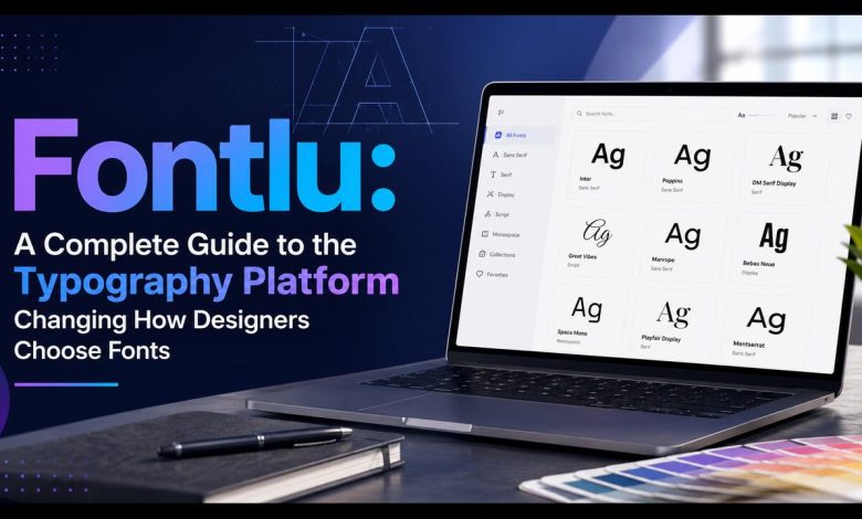
Fontlu is an online typography platform that helps users discover, preview, organize, and apply fonts across their design projects. Rather than functioning as a simple font repository where files sit in long, unsorted lists, Fontlu is built around the idea that choosing a typeface should be an interactive experience. Users can search by style, mood, or intended use, preview how a font behaves with their own text in real time, and move from discovery to application without juggling several separate tools.
At its core, Fontlu brings together three things that used to require different platforms entirely: a searchable font library, a live preview environment, and a management system for saving and organizing favorites. For designers who have spent years switching between font marketplaces, preview generators, and licensing checklists, that consolidation is a meaningful shift in workflow.
It’s worth noting that typography tools in this space vary widely in scope and quality, and Fontlu sits among a newer generation of platforms trying to modernize what has traditionally been a fairly static corner of the design world.
Why Typography Still Matters in Modern Design
Before getting into the specifics of the platform, it helps to understand why so much attention is being paid to font discovery tools in the first place.
Every typeface carries a kind of unspoken personality. A rounded, soft sans-serif feels friendly and approachable. A sharp, geometric font feels confident and modern. A traditional serif feels established and trustworthy. These aren’t just aesthetic preferences; they influence how quickly people read, how much they trust what they’re reading, and whether a brand feels consistent across different platforms.
Poor typography choices can undercut even the strongest design concept. A beautiful logo paired with an ill-fitting font can feel disjointed. A website with inconsistent type sizing can feel unpolished, regardless of how well the layout is structured. This is why platforms built specifically around helping people make better, faster typography decisions have found such a receptive audience.
Core Features of Fontlu
Real-Time Font Previews
One of the most useful aspects of Fontlu is the ability to type actual project text and see it rendered instantly across different typefaces. Instead of imagining how a font might look once it’s dropped into a headline or a paragraph, users can test their exact wording and get an immediate visual sense of spacing, weight, and readability. This removes a lot of the guesswork that traditionally came with font selection, particularly for anyone choosing type for a logo, a landing page, or printed materials where the margin for error is small.
Smart Search and Filtering
Fontlu organizes its collection by style, mood, and use case rather than relying purely on alphabetical listings or category tags that don’t reflect how people actually search. A user looking for something suited to a wedding invitation searches differently than someone building a tech startup’s website, and Fontlu’s filtering system is designed to reflect that. This kind of contextual search saves considerable time compared to manually clicking through hundreds of unrelated typefaces.
Font Pairing Suggestions
Choosing a single font is only part of the challenge; most design projects require at least two typefaces working together, typically one for headings and one for body text. Fontlu includes pairing suggestions that help match complementary fonts, so the overall composition feels intentional rather than mismatched. This is particularly valuable for people without a formal design background who may not intuitively know which combinations work well together.
Licensing Clarity
Font licensing is one of the more overlooked aspects of typography, and it’s also one of the most important. Many free fonts are only free for personal use, while commercial use requires a paid licence. Fontlu displays licensing information clearly alongside each typeface, helping users avoid the common mistake of using a font commercially without the proper rights. This kind of transparency matters, especially for small businesses and freelancers who may not have legal teams double-checking every asset before it goes to print or goes live on a website.
Format Compatibility
Fonts sourced through Fontlu are generally available in widely supported formats such as TTF and OTF, with some collections also offering WOFF for web use. This broad compatibility means fonts can be integrated into most standard design software without conversion headaches, whether someone is working in a desktop publishing tool, a browser-based design app, or a code editor for web development.
Organization and Collection Management
For people working across multiple projects, keeping track of fonts can become surprisingly messy. Fontlu addresses this with collection and favoriting tools that let users group typefaces by project, client, or theme. Rather than re-searching for the same font every time it’s needed, users can build a personal library that reflects their own working style and preferences.
Who Uses Fontlu?
Fontlu’s audience spans a fairly wide range, which is part of why it has grown steadily rather than staying niche.
- Graphic designers and branding professionals: Who need efficient access to a broad typographic range without sacrificing quality or licensing clarity.
- Web developers: Looking for fonts that render well across devices and integrate smoothly into existing codebases.
- Small business owners: Building their own branding without a dedicated design team, who need guidance as much as they need font files.
- Students and hobbyists: Exploring typography as part of learning design fundamentals.
- Marketing teams: Producing consistent visual assets across social media, print, and digital advertising.
This breadth is intentional. Rather than positioning itself purely as a professional tool or purely as a beginner-friendly resource, Fontlu tries to serve both ends of that spectrum through an interface that doesn’t require deep design expertise to use effectively, while still offering enough depth for experienced professionals.
How Fontlu Compares to Traditional Font Libraries
Older font resources tend to fall into one of two categories: large, free repositories with minimal organization, or premium marketplaces that priorities volume over curation. Both approaches have real value, but both also leave gaps that platforms like Fontlu are trying to fill.
Free repositories often lack quality control, meaning users have to sift through a lot of poorly kerned or inconsistently weighted fonts to find something usable. Premium marketplaces, on the other hand, can be excellent in terms of quality but often lack the kind of interactive previewing and pairing tools that make the selection process faster and more confident.
Fontlu positions itself in the middle ground: a curated approach that doesn’t ignore free and accessible options, combined with tools that make evaluating and applying fonts genuinely easier. It isn’t trying to replace every font source available online, but rather to streamline the process of narrowing down choices and applying them correctly once a decision is made.
The Role of Font Quality in Branding and Design
It’s worth spending a moment on why font quality specifically deserves attention, separate from the platform itself.
A well-crafted typeface has consistent stroke weight, proper kerning (the spacing between individual letters), and balanced proportions across every character. These details matter more than most people realize. Poorly made fonts can look fine in a headline but fall apart at smaller sizes, become difficult to read in long paragraphs, or render inconsistently across different software and devices.
This is where the sourcing and vetting behind a platform genuinely matters. A collection built with attention to technical quality, not just visual novelty, tends to hold up better across the many contexts a font will actually be used in, from a business card to a mobile app interface to a printed brochure. Materials and craftsmanship in typography aren’t visible in the way they are with physical products, but they show up just as clearly in how legible, consistent, and professional the final design feels.
Practical Ways to Use Fontlu Effectively
Getting the most out of any font discovery platform comes down to a bit of strategy rather than just browsing at random. A few practical approaches tend to help:
- Start with your brand’s tone, not the font itself. Before searching, think about three or four words that describe the feeling you want, such as modern, warm, authoritative, or playful. Search using those terms rather than jumping straight into browsing categories.
- Test real content, not placeholder text. Typing your actual headline or tagline into the preview tool gives a far more accurate sense of how a font will perform than generic sample text ever will.
- Check licensing before falling in love with a font. It’s easy to build an entire design around a typeface only to discover later that commercial use requires a license you didn’t budget for. Checking this early avoids wasted work.
- Limit pairings to two or three typefaces per project. Even with strong pairing tools available, restraint usually produces cleaner, more professional results than combining too many styles.
- Revisit saved collections periodically. Design trends shift, and a font that felt fresh a year ago might feel dated now. Keeping a rotating collection rather than a static one helps keep branding current.
Typography Trends Shaping Platforms Like Fontlu
The broader typography space has been shifting in a few consistent directions, and it’s useful context for understanding why tools like Fontlu have gained traction.
Variable fonts, which allow a single font file to adjust weight, width, and style dynamically, have become increasingly common because they reduce file sizes and give designers more flexibility without needing separate files for every variation. Responsive typography, where font sizing and spacing adjust automatically across devices, has also become a baseline expectation rather than a nice-to-have, particularly as more browsing happens on mobile devices.
There’s also been a broader move toward accessibility in type design, with more attention paid to how fonts perform for readers with visual impairments or reading difficulties. Clear letterforms, sufficient spacing, and legible weights aren’t just aesthetic choices anymore; they’re increasingly treated as a baseline requirement for professional and public-facing design work.
Platforms that keep pace with these shifts, offering variable font support, mobile-friendly previews, and clear technical information, tend to serve their users better over time than static libraries that haven’t evolved their approach.
Final Thoughts
Typography is one of those design elements that people notice without always realizing why. A well-chosen font quietly supports a brand’s voice, while a poor one can undermine even the strongest visual concept. Platforms like Fontlu have emerged precisely because the process of finding, testing, and applying fonts needed to catch up with how design work actually happens today: quickly, across multiple devices, and often without a dedicated typography specialist on hand to guide every decision.
For anyone regularly working with brand identity, web design, or print materials, taking the time to understand tools like this pays off. Good typography, sourced and applied thoughtfully, remains one of the more understated but powerful ways to make design work feel polished, considered, and genuinely professional. If you’re exploring resources like this for your own projects, it’s worth spending a little time testing different platforms, including Fontlu, to see which one fits your workflow before committing to any single library.
For more design and technology insights, Reuterings regularly covers tools and platforms shaping how creative and digital work gets done.